Let's See How They Improved By Using Our Products
Learn how our customers increase their leads and revenue through personalization and many other features. Check their stories!
Overview Audience Dashboard
Here you will learn the Audience Dashboard which contains a summary of all reports from the Audience that you have created. Here is what the Audience Dashboard looks like:
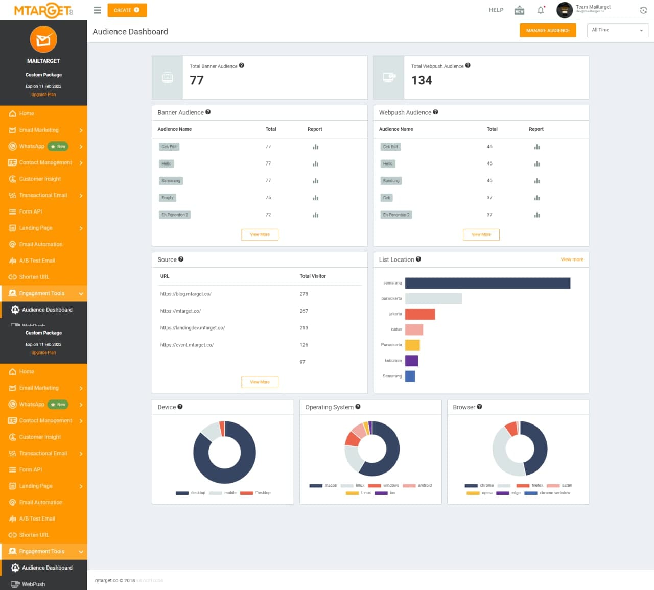
In this section, here you will see the options for filtering report time, such as the last 7 days, the last 30 days and so on. There is also a navigation button which is used to move to ‘Audience Manager’ if you want to manage Audience. If you want to find out how to create an Audience, click the following link.

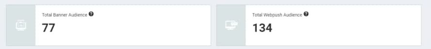
This section will display your entire Audience count in Banner or Webpush.
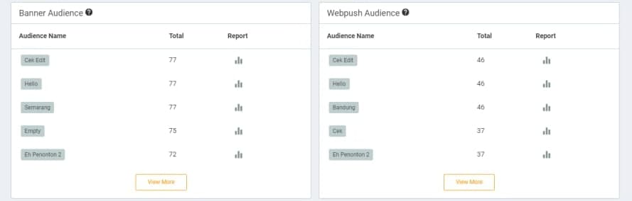
This section shows the entire list of Audiences with the highest number taken from the top 5 from each Audience. So you can see who the most Audience is from each campaign.
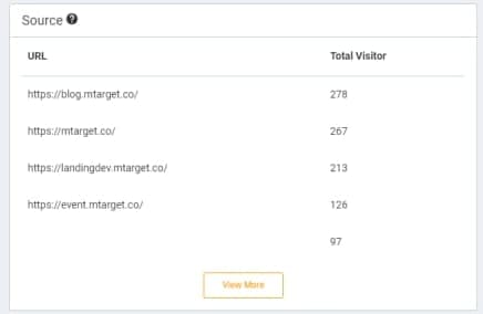
This section will bring up the most engaged links used in Banner or Web push campaigns.
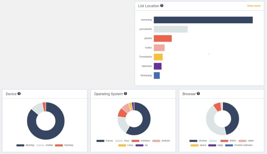
This section displays data device* (Device used by Audience to access the campaign), operating system (operating system on the device used by Audience to access the campaign), browser (browser software used by Audience to access the campaign) campaigns), and location. This list of locations brings up all cities for the audience to access the campaign with the highest number of people. For example, in the top ranking it says ‘Semarang’, it means that Semarang City is the location with the largest number of audiences.