Let's See How They Improved By Using Our Products
Learn how our customers increase their leads and revenue through personalization and many other features. Check their stories!
Select Category
| About Free Email Sender |
| About Resend Softbounce |
| About Send Time & Email Scheduler |
| Add Voucher Components in Email |
| Basic Tutorial - Component on Email Marketing |
| Basic Tutorial - Compose and Send Email |
| Basic Tutorial - Email Report |
| Basic Tutorial - Overview Email Marketing |
| Cancel Schedule Email Marketing |
| Email List and Draft Email Editing |
| Email Personalization |
| Global Setting Email Marketing |
| Guide to Creating Welcome Email with the MTARGET Feature |
| HTML Email Limitation |
| How to Add Image in Email |
| How to Change the Email Footer |
| How to Display Company Profile Picture in Email Recipient's Inbox |
| How to Duplicate Email |
| How to Group Campaign Email Marketing |
| How to send HTML emails |
| How to testing your email Test with Contact Tester |
| Knowing the Most Clicked Links with the Heatmap Report |
| Managing Sender Profiles and Validating Emails |
| Troubleshoot, Active email labeled as a hard bounce |
| Troubleshooting Email sender is missing |
| Tutorial Exclude and Include Contact Labels |
| Why did my email go to Gmail Promotion Tabs? |
| Add Map with Google Maps on the Page |
| Add multiple domains to the Page |
| Added Facebook Pixel Tracker on the Page |
| Adding Videos on Page |
| Basic Tutorial - Component on Page |
| Basic Tutorial - Create and Publish Pages |
| Basic Tutorial - Overview Page |
| Checking Report on Your Page |
| Crisp Chat Integration on Page |
| Custom Domain |
| How to Create a Section Page |
| How to Make a Thank You Page |
| How to add a Podcast Player on the Page |
| How to add images to the line model |
| How to add text by category |
| How to make Pop-up on Page |
| How to make a testimonial column |
| How to unpublish a page |
| Make a Pop-up on Video |
| Manage Default Page |
| Page integration in Ghost |
| Page integration in Joomla |
| Page integration in Squarespace |
| Page integration on Blogger |
| Page integration on Instapage |
| Page integration on Wix |
| Page integration with Disqus |
| Share a Page |
| WhatsApp Chat integration on the Page |
| Basic Tutorial - Create Form |
| Basic Tutorial - How to Create a Form Without Pages |
| Basic Tutorial - Overview Form API |
| Component on Form |
| Deletes a Contact in the Form |
| Form Detail |
| Form WebHook URL |
| How to Create an Interactive Form |
| How to Install Forms on Your Website |
| How to Install Forms on Your Website with HTML Code |
| How to Install Popups on your Website |
| How to Send a Copy of Form Data to the User |
| How to add a form to your website with the API code |
| How to display per-column forms |
| Using API |
| Using Captcha |
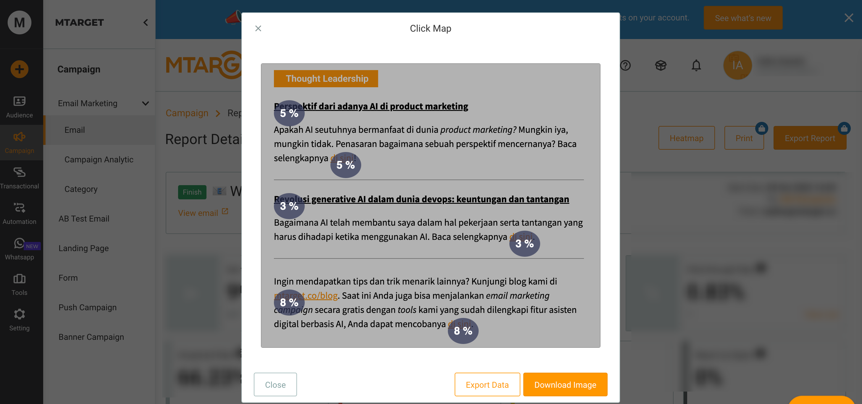
Knowing the Most Clicked Links with the Heatmap Report
Here you’ll learn how to understand the most clicked links in an email you send to a recipient. There are 2 features that can facilitate this, the first is through the CTR (Click-through-rate) report and the Heatmap.
If you want to understand more about CTR, you can read it here. Here you will learn about the Heatmap report.
In summary, this email report heatmap will assist you in visualizing which links are the most clicked on in emails sent to recipients. There will show which areas are the most clicked based on the most popular links that are most clicked by the user.
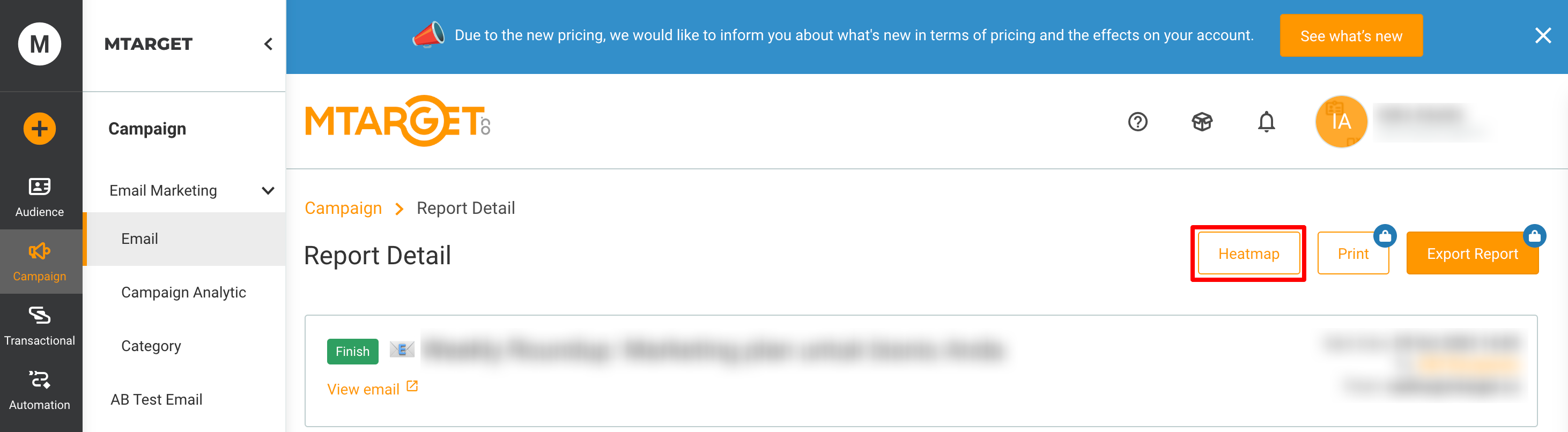
Heatmaps work based on links. As mentioned earlier, heatmaps display a visual of the most clicked links in a single email. If you access the Heatmap feature, a bubble will appear on each link, if a recipient clicks. The more recipients who click on a link, the color bubble will change and the percentage will increase.