Let's See How They Improved By Using Our Products
Learn how our customers increase their leads and revenue through personalization and many other features. Check their stories!
Component on Form
You are able to do some configurations on your form :
Name : shows form name that you created
Contact Form : shows if the data of the form filler will be saved in your contact. If “Yes”, then the data will be saved in contact. If “No”, then the data will not be saved in contact and just shown on report.
Labels : If you select “Yes” on Contact Form, then it will be shown the labels of the saved contact.
As long as there is no data saved in form, you are able to edit configuration on above. Just simply click Configuration, then you are able to make changes like 3 points above.
You can add components in the form via the plus button located in the right corner, then a component will appear that you can choose from. ![]{https://res.cloudinary.com/mailtarget/image/upload/v1630898094/tutorial/form_new_component.gif}
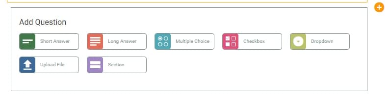
Here are components that we’ve provided:
You are able to add component in form of short text. On the Text Field you can do some configuration:
Required
If you intend to create required Text Field, then set the required into “Yes”.
Field Tag
Select field tag of your place then it will call the data if it has already saved contact.
Field Type
Select field type for data type that the form filler required to fill.
There are 3 kinds of field type, they are:
Title
Type the title from Text Field on Form. You are also able to do setting if the title of the field will be shown or not. If you select “Show”, then it will be shown. If you set “Hide”, then it will not be shown.
Placeholder
A guide for form fillers about the content of the forms, what they are going to fill. For example: Insert your name.
You are able to add components in form of long text. On the Text Area you can do some configuration:
Required
If you intend to create required Text Field, then set the required into “Yes”.
Field Tag
Select field tag of your place then it will call the data if it has already saved contact.
Title
Type the title from Text Area on Form. You are also able to do setting if the title of the field will be shown or not. If you select “Show”, then it will be shown. If you set “Hide”, then it will not be shown.
Placeholder
A guide for form fillers about the content of the forms, what they are going to fill. For example: Insert your description.
You are able to add components in form of set of choices, but there just one that you able to select. On the Multiple Choice you can do some configuration:
Required
If you intend to create required Multiple Choice, then set the required into “Yes”.
Field Tag
Select field tag of your place then it will call the data if it has already saved contact.
Title
Type the title from Multiple Choice on Form. You are also able to do setting if the title of the field will be shown or not. If you select “Show”, then it will be shown. If you set “Hide”, then it will not be shown.
Choices
Image Choices
Select “Yes” if you want to add a selection of images on the form.
Other Choices
Select “Yes” if you want to add a selection that could manually filled by the audience.
Label Choices
This option will show if you just selected “Yes” on image choices. If you select “Yes” on choices label, then you can add note on image choices.
Style
List : The image will display vertically.
Grid : The image will display horizontally with one row contains 2 images.
If the content configuration has finished, click Save button to save the configuration.
You are able to add components in form of set of choices, but user could select more than one selection. On the Checkbox you can do some configuration:
Required
If you intend to create required Checkbox, then set the required into “Yes”.
Title
Type the title from Checkbox on Form. You are also able to do setting if the title of the field will be shown or not. If you select “Show”, then it will be shown. If you set “Hide”, then it will not be shown.
Choices
Image Choices
Select “Yes” if you want to add a selection of images on the form.
Other Choices
Select “Yes” if you want to add a selection that could manually filled by the audience.
Label Choices
This option will show if you just selected “Yes” on image choices. If you select “Yes” on choices label, then you can add note on image choices.
Style
List : The image will display vertically.
Grid : The image will display horizontally with one row contains 2 images.
If the content configuration has finished, click Save button to save the configuration.
You are able to add components in form of set of choices, but there just one that you able to select. On Dropdown you can do some configuration:
Required
If you intend to create required Dropdown, then set the required into “Yes”.
Field Tag
Select field tag of your place then it will call the data if it has already saved contact.
Title
Type the title from Dropdown on Form. You are also able to do setting if the title of the field will be shown or not. If you select “Show”, then it will be shown. If you set “Hide”, then it will not be shown.
Options
Type title that you will give to the form-filler. Add More Option to give more kind of selection.
If you want to add a section for uploading files, you can use this component. You can set the maximum file size by yourself, but our system limits it to a maximum file size of 20mb.
Required
If you want to make the Upload File mandatory for readers, then the required setting is located on “Yes”.
Field Tags
Select the tag field where you will call the data if it has been saved in the contact.
Title
Write the title of the Dropdown on the Form. You can also set whether the title will be displayed or not. If “Show”, it will be displayed. If “Hide”, it will not be displayed.
Max Size
You can set the maximum file size yourself, with a limit on the largest file size, which is 20mb.
This component can be used as a delimiter of each Form section that you want to create. For example you want to create a Form and then divide it into 2 parts, you can use this component.
Show Title
Option to display the title in each section.
Section Title
Here you can give the title of each section.