Layout
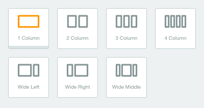
Before you adding a content, you are able to add layout when creating a page. There are 7 kinds of layout that we provide:
- 1 column : adding a layout of one section in a long line on compose page.
- 2 column : adding a two-column layout with the size of each of the same columns in one section on the compose page.
- 3 column : adding a three-column layout with the size of each of the same columns in one section of the compose page.
- 4 column :adding a four-column layout with the size of each of the same columns in one section of the compose page.
- Wide left : adding a two-column layout with the size on left-column is bigger than the right-column in one section of the compose page.
- Wide right : adding a two-column layout with the size on right-column is bigger than the left-column in one section of the compose page.
- Wide middle : adding a three-column layout with the size on middle-column is bigger than the left-column or the right-column in one section of the compose pa
You are able to do drag and drop to set the position on each section according to your needs.
Component
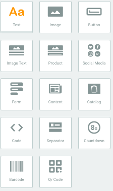
You are able to add component inside of page that you are creating. Components that we provide are:
Text
You can add components in text format. On text format you are able to do settings:
- Content : set the text colour, font type, font size and line height.
- Background & Spacing : set the colour background, padding and margin.
- Links : set the colouring and underline of links.
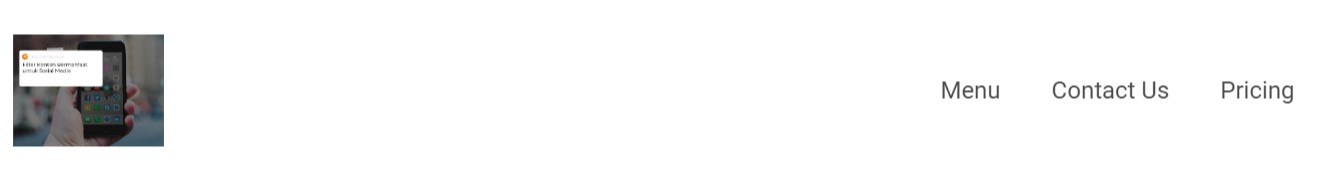
Image
You can add components in the form of images. In the image you can make settings including:
- Action
Here you can give the image action. For example, when a visitor clicks on the image, the action you specify will appear.
- Content
- Image: Action button to upload an image.
- Shape: There are 3 options for giving shapes in the image to choose from. Like making a circle, square, or no masking image.
- Size: You can select 3 size options that you want to determine from the uploaded image. Like Original for the original size of the image, Custom to resize the image to the desired size, and edge to edge to select an image size that adjusts the Page size.
- Align: image layout settings (center, left, right)
- Background & Spacing: adjusts the background color, padding and margin.
Note: The maximum image size you can use is 5MB.
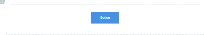
You are able to add component formed in button to direct to other links. Inside the button format, you are able to do setting as follows:
- Content
- Title : setting on text color, size and type of the font on the button.
- Button : setting on title button, radius, background color, width and height.
- Border : setting on border size and color.
- Align : setting on button position.
- Background & Spacing : set the background color, padding and margin.
- Links : direct the image direction.
- Web : direct to some web, you are simply just entering the URL of your website destination.
- Mailto : direct to response to the message sent. User should type email address, subject and the body.
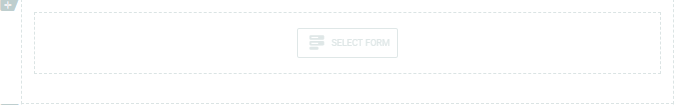
You are able to add the form component that you have ever created through Form API menu or create a new form through the component.
If you want to create a new form
You are able to click Create New. Then, fill the form name you desired. Then, you are able to do setting on Contact Saved. If you set it as “Yes”, then the data of people that have filled form will be automatically saved in contact. Don’t forget to add label on those contact for your convenience. If “No”, then data of people that has filled the form will not be saved in contact.
If you want to use created form
You are able to select one of created forms by clicking on Select.
The next setting that you are able to do in the Form as follows:
- Form Detail : to change used form or edit the form.
- Content : to set the font type, font size, font type and background color.
- Background & Spacing : to set the background color, padding and margin.
- Button : setting on title button, radius, background color, width and height.
Image Text
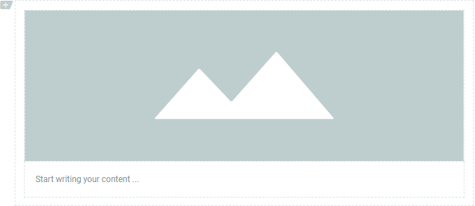
You are able to add component formed in image and text in one component.
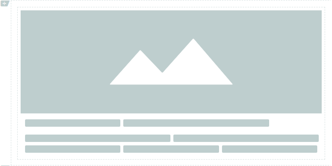
Product
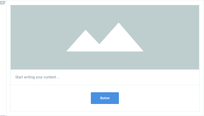
You are able to add component formed in image, text and button in one component.
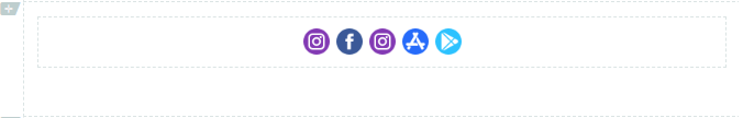
You are able to add component formed social media button (a button that will direct you to your social media account). Just copy your social media profile’s URL and paste on it.
Content
You are able to generate content from a web, just simply copy and paste the link of the content. You can do some settings on Content as follows:
- Generate Content : It will generate the content with copy and paste the content’s URL you desired. Set “Yes” on Load Javascript if you want to process javascript script. Set as “No” if you don’t want to process javascript script.
- Style contents : set the content location
- Show Image : to show the image (content)
- Show Description : to show the content’s description
- Image
- Source : to upload image upload gambar
- Align : set image position
- Title : title writing, setting of title color, font type, font size and line height on content title.
- Description : setting on font color, font type, font size and line height on content description.
- Background & Spacing : setting on color background, padding and margin.
via GIPHY
You can embed any kind of html code into MTARGET page, like YouTube video, Instagram photo, Twitter and etc.
In adding component, you are able to add component or create the layout first. You are able to add component on layout column. To add component, you are able to click plus button or drag and drop the component. In each column, you are able to add more than one component.
Catalog
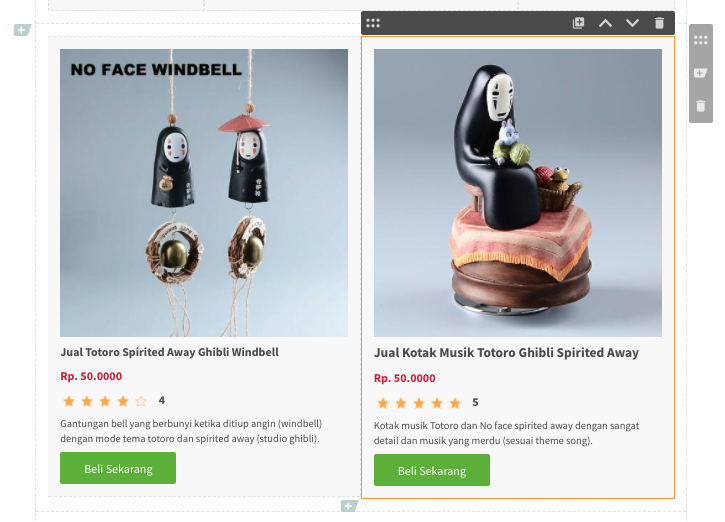
You can generate a catalog from a web, as easy as copy and paste the link on the content. Catalogs you can use to add product content to email. In the catalog you can make arrangements include:
- Content : it will generate catalog with copy and paste the content’s URL you desired. Set “Yes” on Load Javascript if you want to process javascript script. Set as “No” if you don’t want to process javascript script.
- Style contents : layout product settings
- Image : displayed image product
- Product Name : displayed name product
- Price : displayed price product
- Rating : displayed product rating
- Description : displayed description product
- Button : displayed product button
- Image
- Source : upload image
- Align : image layout settings
- Product Name : to write the title, and settings on the color, type, text size and line height of the content line.
- Price : pricing, and settings on the color, type, text size and line height of the content title.
- Rating : rating writing, and rating icon settings.
- Description : setting on the color, type, text size and line height of the content description.
- Button : setting of product button.
- Background & Spacing : setting the color background, padding and margins.
Separator
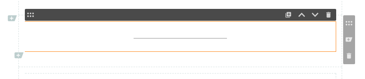
You can add a separator component. In the separator you can do the settings include:
- Content
- Color : change the separator color
- Size : size of separator thickness
- Length % : length separator size
- Style : change the separator style
Countdown
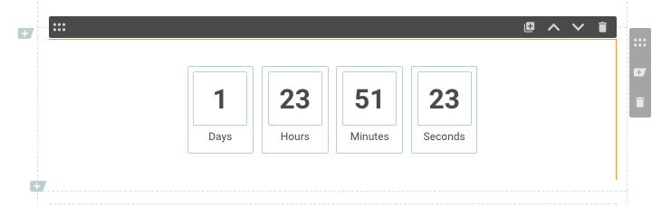
You can add a countdown component. On countdown, you can use it to calculate the countdown time. For example, it is used to calculate the countdown time of the release of your product. For countdown settings include:
- Content
- Expiration Date: Expiry date of countdown, you can use along with clock details.
- Style: Change the countdown model
- Size: Change the countdown size
- Align: Change the countdown position
- Color: Change the countdown color
- Label: Change the date label on the countdown
- Text Formatting
For text formatting, you can make changes to the settings on color, type, text size and line height.
QR Code
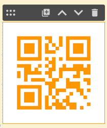
You can add components in the form of a QR Code. In the QR Code, you can use it as a medium to abbreviate your promotional url, video or contact. So that you make it easier and simple to display your landing page. QR Code settings include:
-Content
- Color: Change the color of your QR Code
- Background: Change the background color of your QR Code
- Align: Change the position of the QR Code
- Width (%): Change the size of your QR Code in the form of a percentage
- URL: Add the URL address that will be generated into a QR Code
-** Background & Spacing**
- Background: Change the background color
- Padding: Set the space in the background
- Margin: Set the margin in the background
Barcode
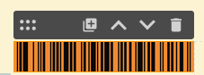
You can add a component in the form of a barcode. In Barcodes, you can use it as a medium to abbreviate your promotional url data, video or contact. So that you make it easier and make it simple to display your landing page. For Barcode settings include:
-Content
- Color: Change your Barcode color
- Background: Change your Barcode background color
- Align: Change the position of the Barcode
- Width (%): Change the size of your Barcode in the form of a percentage
- Data: Add data to generate Barcode
-** Background & Spacing**
- Background: Change the background color
- Padding: Set the space in the background
- Margin: Set the margin in the background
Podcast
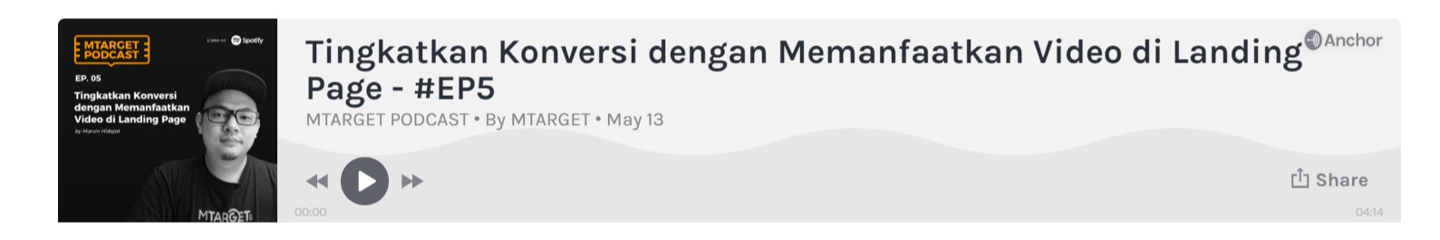
Now you can add the podcast player on the Page that you created by adding it through the embed code. There are two sources that you can use, namely Anchor and Soundcloud.
Please note, you will install the embed code in this component, not the link. In addition we also recommend that the podcast player display more optimally, by changing the width code to 100%. For example like this:
that is the embed code from Anchor on the MTARGET podcast. Now you will change the width to 100% so that the display is more leverage. Look for the width code then change it to the following:
From width = “400px” to width = 100%.
Navigation
This component functions to add a menu for navigation to the link you want.
- There are two types that can be used:
- Button Only: Only displays menus in written form only.
- Logo & Button: Displays a complete menu with logos.
- There are three types of positions to choose from:
- Left: Makes the menu appear on the left.
- Center: Make the menu appear in the center of the page.
- Right: Makes the menu appear on the right.
- Block: Makes the menu appear on the right and the logo on the left. (If you choose ‘Logo & Button’)
- Logo (Will only appear when you select the ‘Logo & Button’ type)
- Image
- Max width: Change the size of your navigation width in the form of a percentage.
- Height mode: ** Auto ** uses configuration from Max Width and ** Specific ** uses configuration from Max Height.
- Max Height (If in Height Mode you choose Specific): Change the height of your navigation buttons in pixels.
- Button
- Wrap Mode: Function to adjust the display of navigation buttons that are more responsive.
- Background: Makes settings in the form of a background color.
- Radius: Make a radius.
- Border: Settings for the color and size of the border.
- Links
Here you can add and manage navigation buttons that will appear. You can also set a link to the link you want or to the Page that you have created.
Google map
You can add locations on your Page by using Google Maps. To put a map on the Page, you will need an embed code to bring it up.
If you have trouble finding the embed code on Google Maps, you can access it through the following steps:
- Locate the location you want to display on Google Maps.
- After finding it, click the ‘Share’ button.
- Click the ‘Embed a Map’ tab. Then click the ‘Copy HTML’ button.
For more complete steps, you can read it here
Inline Image
You can add images with lined models using this component. For complete steps you can read here
Collapse
By using this component you can add categorized text. Making it easier for you to make neat writing according to each info.
Testimonials
This component helps you make a more interesting section for your testimonial needs on your Page. For the complete steps, you can read here
Carousel
This component will help you to load images with a slideshow that you can add yourself.